CASE STUDY
Monash University 2020 Course Guides
CLIENT
Monash University via BPO Intelligence
MY ROLE
Graphic Designer: concept development and full publication design across the suite
SCOPE
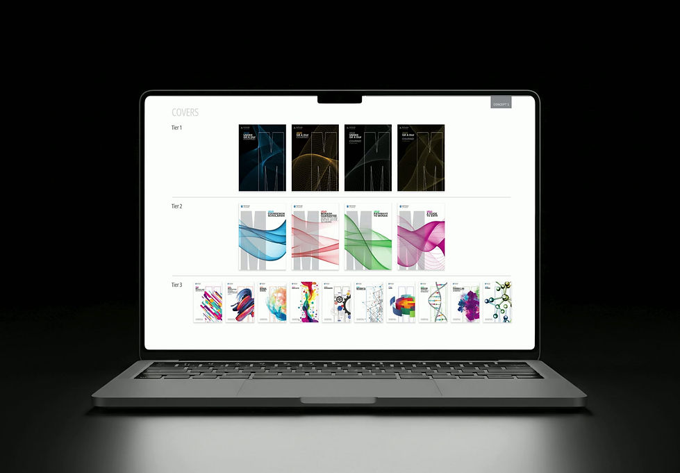
Twenty-eight course guides across three publication tiers, 10 months of studio production
BRIEF
Design the Monash University 2020 Course Guide suite, a system of twenty-eight guides across three publication tiers, working within Monash's existing brand standards while pushing the design to feel more engaging and inspiring than previous years.
The three tiers ranged significantly in scale and complexity: undergraduate and postgraduate guides running 200+ pages, department guides between 50 and 100 pages, and specialist course and pathway guides between 10 and 30 pages. The project required close collaboration with multiple stakeholder groups including Monash's head marketing team and the individual marketing teams across each faculty and department.

CHALLENGE
Designing at this scale inside an established brand system requires a different kind of creative discipline. The challenge was not reinvention, it was elevation.
Finding ways to make the work feel fresh, engaging and distinctly better than what came before, while staying coherent across twenty-eight guides, satisfying multiple layers of stakeholders, and maintaining absolute consistency across hundreds of pages of layouts, tables, typography and imagery.
Managing competing opinions from the head marketing team and individual department teams added a layer of complexity that no design brief fully prepares you for.
OUTCOME
A cohesive, scalable publication system across twenty-eight guides representing one of the largest single publication programmes in Monash's communications calendar.
The unified visual language gave the suite a professional consistency that strengthened the university's brand presence across the full prospectus range, delivered on time across a 10 month production schedule.
APPROACH
The project began with a concepting phase. Our studio of four designers and a creative director each developed one of three directions: safe, bold and outrageous. I was assigned bold. When we presented to Monash, the client responded to elements across all three concepts, so we went into a refinement phase, combining the strongest visual elements and systems into a single unified direction.
Once the concept was locked, the full studio set to work producing all twenty-eight guides collaboratively. The work was split evenly across the team, with a peer review process built in throughout, checking each other's layouts, interrogating consistency, and collectively upholding the visual system across every tier and every page.
It was methodical, detailed work: grid systems, typographic hierarchies, table design, image treatment and iconography, all needing to hold together across an enormous body of output delivered across multiple deadline and review gates.
WHAT I LEARNED
This project taught me more about the craft of design than almost anything before or since. Working at this scale for the first time, I developed the organisational discipline, file management habits and attention to detail that I still rely on today. I nerded out on guttering widths, table margins and InDesign shortcuts in a way that only comes from spending months inside a single complex system.
It also gave me my first real experience of managing multiple stakeholders with competing opinions, and the patience, communication and diplomacy that requires. A formative project in every sense.